Streamlitでdbt-elementary風ダッシュボードを作成する

こんにちは、中村です。
皆さんは、dbt Projects on Snowflakeでは実行できるコマンドが限られていて、残念に思ったことはないでしょうか。
特にdbt testの結果をダッシュボード形式で確認できるdbt-elementaryを使われている方はそう思っていることでしょう。
逆にdbt Projects on Snowflakeではdbt testの結果を詳しく見れない問題があります。
そこで今回は拡張機能であるdbt_artifactとstreamlitを使ってdbt-elementary風ダッシュボードを作成していきます。
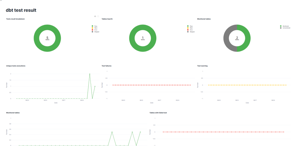
完成図イメージはこちらです。
目次
- dbt-elementaryとは
- dbt_artifactとは
- ダッシュボードの作成
- まとめ
- おまけ
dbt-elementaryとは
ご存じでない方もいると思うので、dbt-elementaryについて簡単に解説します。
dbt-elementaryは、dbtの実行ログやメタデータを収集し、データ品質テストや異常検知テストを可視化できるツールです。
Elementary公式のGitHubでデモダッシュボードを掲載しているので、こちらから見ることができます。
今回はフィルターと2段目(Freshness等)以外のグラフを作成します。
dbt_artifactとは
こちらは、dbt-artifactと呼ばれるdbt実行時に生成されるjsonファイルのメタデータをテーブルとしてモデル化し、データウェアハウス内で分析しやすくしてくれる外部パッケージです。
※jsonファイル群 → dbt-artifact、外部パッケージ → dbt_artifact です。ハイフンとアンスコで違います。
ダッシュボードの作成
準備
まずはdbtプロジェクトを作成します。基本的な作成方法はこちらで解説しています。
通常のモデル作成に加えて、拡張機能の設定とtestの設定を行います。
拡張機能の設定はpackages.yamlを作成し、以下を記入してください。
packages:
  - package: brooklyn-data/dbt_artifacts
    version: 2.9.3
できたら、dbt deps(dbt Projects on Snowflakeなら依存関係)を実行しましょう。
同じ階層にdbt_packagesフォルダができたらこちらは完了です。
続いてtestの設定を行います。
<model名>.yamlを作成してtestsを記入してください。このときにnameを”テスト名/テーブル名/カラム名”となるように設定してください。ビューでテスト名やテーブル名を使うのに、デフォルトだと _(アンスコ)でつながれてしまい、処理するのが難しいのが理由です。
version: 2

models:
  - name: int_sales
    description: "売上データに商品マスタ・顧客マスタを結合した中間モデル。"
    meta:
      owner: "data_team@sales.co.jp"
      domain: "sales"
    tags: ["intermediate", "sales"]

    columns:
      - name: datetime
        description: "売上日時"
        tests:
          - unique:
              name: "unique/int_dbt_sales/datetime"
          - not_null:
              name: "not_null/int_dbt_sales/datetime"

      - name: product_name
        description: "商品名(mst_productから取得)"
        tests:
          - not_null:
              name: "not_null/int_dbt_sales/product_name"

      - name: price
        description: "商品単価(mst_productから取得)"
        tests:
          - not_null:
              name: "not_null/int_dbt_sales/price"

      - name: number
        description: "売上数量"
        tests:
          - not_null:
              name: "not_null/int_dbt_sales/number"

      - name: customer_name
        description: "顧客名"
        tests:
          - not_null:
              name: "not_null/int_dbt_sales/customer_name"

      - name: status
        description: "顧客ステータス(mst_customerから取得)"
ここまで作成できたらdbt buildを実行して、完了です。
使用するビューの作成
dbt buildが実行できたら、dbt_artifactによって実行のデータを表示するビューが作成されます。
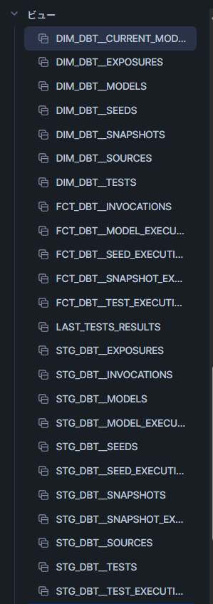
これを使ってStreamlitで使うビュー、TESTS_RESULTS を作成していきます。
SQLワークシートで以下を実行して、先ほどのビューの並びに作成されたら完了です。
create or replace view <DB>.<schema>.TESTS_RESULTS (
    RUN_STARTED_AT,
    DATE,
    COUNT_PASS,
    COUNT_WARN,
    COUNT_ERROR,
    COUNT_SKIPPED,
    TABLE_STATUS_PASS,
    TABLE_STATUS_WARN,
    TABLE_STATUS_ERROR,
    TABLE_STATUS_SKIPPED,
    COUNT_TESTED_TABLES,
    ALL_TABLES,
    COUNT_UNIQUE_TESTS
) as
with base as (
    select
        f.run_started_at,
        d.name as test_name,
        d.depends_on_nodes as tested_tables,
        f.status as execution_status
    from FCT_DBT__TEST_EXECUTIONS f
    left join DIM_DBT__TESTS d
        using (COMMAND_INVOCATION_ID, NODE_ID)
),
execute as (
    select
        run_started_at,
        count(distinct iff(package_name != 'dbt_artifacts', package_name, null)) as tables
    from DIM_DBT__MODELS
    group by run_started_at
),
latest_base as (
    select distinct
        run_started_at,
        test_name,
        case
            when test_name like 'unique%' then 1 else 0
        end as unique_tests,
        execution_status,
        tested_tables,
        case
            when sum(case when execution_status = 'skipped' then 1 else 0 end) > 0 then 'skipped'
            when sum(case when execution_status = 'error' then 1 else 0 end) > 0 then 'error'
            when sum(case when execution_status = 'warn' then 1 else 0 end) > 0 then 'warn'
            else 'pass'
        end as table_status,
        tables
    from base
    left join execute
        using (run_started_at)
    group by
        run_started_at,
        test_name,
        execution_status,
        tested_tables,
        tables,
        unique_tests
)
select
    run_started_at,
    date(run_started_at) as date,
    count(distinct iff(execution_status = 'pass',    test_name, null)) as count_pass,
    count(distinct iff(execution_status = 'warn',    test_name, null)) as count_warn,
    count(distinct iff(execution_status = 'error',   test_name, null)) as count_error,
    count(distinct iff(execution_status = 'skipped', test_name, null)) as count_skipped,
    case when table_status = 'pass'    then 1 else 0 end as table_status_pass,
    case when table_status = 'warn'    then 1 else 0 end as table_status_warn,
    case when table_status = 'error'   then 1 else 0 end as table_status_error,
    case when table_status = 'skipped' then 1 else 0 end as table_status_skipped,
    count(distinct tested_tables) as count_tested_tables,
    max(tables) as all_tables,
    sum(unique_tests) as count_unique_tests
from latest_base
group by
    run_started_at,
    table_status_pass,
    table_status_warn,
    table_status_error,
    table_status_skipped;
Streamlitの作成
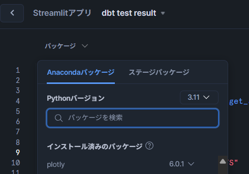
TESTS_RESULTS の作成が確認たらStreamlitを作成していきます。
Snowsightで新規作成して、パッケージにplotlyをインストールしてから、以下を実行してください。
import streamlit as st
import pandas as pd
import plotly.graph_objects as go
from snowflake.snowpark.context import get_active_session

# 現在のSnowpark sessionを取得
session = get_active_session()

# Snowflake上のビュー名
view_name = "<DB>.<Schema>.TESTS_RESULTS"

# Snowpark DataFrameとして取得
df_snowpark = session.table(view_name)

# pandas DataFrame に変換
df = df_snowpark.to_pandas()

theme = st.sidebar.radio("Theme", ["dark", "light"])
center_text_color = "black" if theme == "light" else "white"

st.set_page_config(
    page_title="dashboard",
    layout="wide"  # 横幅いっぱいに表示する
)
st.title("dbt test result")

# グラフレイアウト
col1, col2, col3 = st.columns(3)
col4, col5, col6 = st.columns(3)
col7, col8 = st.columns(2)


# 円グラフを作る関数
def Tests_result_circle(values, labels, colors, title):
    fig = go.Figure(data=[go.Pie(
        labels=labels,
        values=values,
        hole=0.6,
        marker_colors=colors,
        textinfo="none",
        hovertemplate="%{label}: %{value} <extra></extra>"
    )])
    # 中央に合計値
    fig.add_annotation(
        text=str(sum(values)),
        x=0.5, y=0.52,
        font=dict(size=30, color=center_text_color),
        showarrow=False
    )
    # 中央の下に "tests"
    fig.add_annotation(
        text="tests",
        x=0.5, y=0.45,
        font=dict(size=16, color=center_text_color),
        showarrow=False
    )
    fig.update_layout(title_text=title, title_x=0.0)
    return fig


# ラインチャートを作る関数
def Tests_result_trend(date, number, title, color):
    date = pd.to_datetime(date)
    df = pd.DataFrame({"date": date, "number": number})
    df = df.groupby("date", as_index=False).sum()

    latest_date = df["date"].max()
    start_date = latest_date - pd.Timedelta(days=30)

    full_dates = pd.date_range(start=start_date, end=latest_date)
    df_indexed = df.set_index("date").reindex(full_dates, fill_value=0).rename_axis("date")

    fig = go.Figure()
    fig.add_trace(go.Scatter(
        x=df_indexed.index,
        y=df_indexed["number"],
        mode="lines+markers",
        name="pass",
        line=dict(color=color),
        hovertemplate="%{x|%m/%d}<br>value: %{y} <extra></extra>"
    ))

    fig.update_layout(
        title_text=title, title_x=0.0,
        xaxis_title="Date", yaxis_title="Number",
        yaxis=dict(range=[0, df_indexed["number"].max() * 1.1])
    )
    fig.update_xaxes(tickformat="%m/%d")
    return fig


# ラインチャート(割合表示)
def Tests_result_trend_div(date, number, title, color):
    date = pd.to_datetime(date)
    df = pd.DataFrame({"date": date, "number": number})
    df = df.groupby("date", as_index=False).max()

    latest_date = df["date"].max()
    start_date = latest_date - pd.Timedelta(days=30)

    full_dates = pd.date_range(start=start_date, end=latest_date)
    df_indexed = df.set_index("date").reindex(full_dates, fill_value=0).rename_axis("date")

    fig = go.Figure()
    fig.add_trace(go.Scatter(
        x=df_indexed.index,
        y=df_indexed["number"],
        mode="lines+markers",
        name="pass",
        line=dict(color=color),
        hovertemplate="%{x|%m/%d}<br>value: %{y} %<extra></extra>"
    ))

    fig.update_layout(
        title_text=title, title_x=0.0,
        xaxis_title="Date", yaxis_title="Number",
        yaxis=dict(range=[0, 1])
    )
    fig.update_xaxes(tickformat="%m/%d")
    return fig


# 各グラフ
with col1:
    st.plotly_chart(
        Tests_result_circle(
            values=[df.iloc[0]["COUNT_PASS"], df.iloc[0]["COUNT_WARN"],
                    df.iloc[0]["COUNT_ERROR"], df.iloc[0]["COUNT_SKIPPED"]],
            labels=["Pass", "Warn", "Error", "Skipped"],
            colors=["#4CAF50", "#FFC107", "#F44336", "#7d7d7d"],
            title="Tests result breakdown"
        ),
        use_container_width=True
    )

with col2:
    st.plotly_chart(
        Tests_result_circle(
            values=[df.iloc[0]["TABLE_STATUS_PASS"], df.iloc[0]["TABLE_STATUS_WARN"],
                    df.iloc[0]["TABLE_STATUS_ERROR"], df.iloc[0]["TABLE_STATUS_SKIPPED"]],
            labels=["Pass", "Warn", "Error", "Skipped"],
            colors=["#4CAF50", "#FFC107", "#F44336", "#7d7d7d"],
            title="Tables health"
        ),
        use_container_width=True
    )

with col3:
    st.plotly_chart(
        Tests_result_circle(
            values=[df.iloc[0]["COUNT_TESTED_TABLES"],
                    df.iloc[0]["ALL_TABLES"] - df.iloc[0]["COUNT_TESTED_TABLES"]],
            labels=["Monitored", "Unmonitored"],
            colors=["#4CAF50", "#7d7d7d"],
            title="Monitored tables"
        ),
        use_container_width=True
    )

with col4:
    st.plotly_chart(
        Tests_result_trend(
            date=df.iloc[:]["DATE"],
            number=df.iloc[:]["COUNT_UNIQUE_TESTS"],
            color="#4CAF50",
            title="Unique tests executions"
        ),
        use_container_width=True
    )

with col5:
    st.plotly_chart(
        Tests_result_trend(
            date=df.iloc[:]["DATE"],
            number=df.iloc[:]["COUNT_ERROR"],
            color="#F44336",
            title="Test failures"
        ),
        use_container_width=True
    )

with col6:
    st.plotly_chart(
        Tests_result_trend(
            date=df.iloc[:]["DATE"],
            number=df.iloc[:]["COUNT_WARN"],
            color="#FFC107",
            title="Test warning"
        ),
        use_container_width=True
    )

with col7:
    st.plotly_chart(
        Tests_result_trend_div(
            date=df.iloc[:]["DATE"],
            number=df.iloc[:]["COUNT_TESTED_TABLES"] / df.iloc[:]["ALL_TABLES"],
            color="#4CAF50",
            title="Monitored tables"
        ),
        use_container_width=True
    )

with col8:
    st.plotly_chart(
        Tests_result_trend(
            date=df.iloc[:]["DATE"],
            number=df.iloc[:]["COUNT_ERROR"],
            color="#F44336",
            title="Tables with failed test"
        ),
        use_container_width=True
    )
先ほどのdbt testの結果が表示されたら完了です。
まとめ
今回はStreamlitとdbt-artifactを使って、dbt-elementary風のダッシュボードを作成しました。
dbt-elementaryにはほかにも、各testの実行時間の確認やSlackに通知できる機能があるので、全部はカバーしきれていませんが、dbt testの結果がSnowflakeで見られるのはうれしいですね。
またStreamlitでpagesを使えば実行結果の表ページなども簡単に見ることができますね。興味があれば、ぜひやってみてください。
おまけ
on-run-endにSlackのwebhookとStreamlitの共有リンクを貼れば、実行終わりにダッシュボード確認ができます
#dbt_project.yaml
...
on-run-end:
  - >
    curl -X POST -H "Content-type: application/json"
    --data '{"text": "dbt build 完了 🎉",
             "attachments": [
               {
                 "text": " <https://app.snowflake.com/**************?ref=snowsight_shared|dbt testの結果>"
               }
             ]}'
    https://hooks.slack.com/services/XXXXXXXXX/XXXXXXXXX/XXXXXXXXXXXXXXXXXXXX